Our everyday gestures and movements often go unnoticed and neglected. This workshop brings these gestures to light, through examining a small dictionary of these behaviours and movements of the interaction between humans, machines and media.
Using a toaster
Self checkout at the shops
paying using apple pay
Tapping on and off public transport
Neural Interface for Environmental Control: Imagine a speculative interface that allows users to control their surroundings using neural signals. This interface consists of a wearable device equipped with sensors that capture brain activity and translate it into commands for smart home devices, lighting systems, and appliances. By simply imagining specific actions or environments, users can trigger corresponding changes in their surroundings, making home automation more intuitive and seamless.
Gesture-Controlled Smart Glasses for Accessibility: Imagine a pair of smart glasses equipped with advanced gesture recognition technology specifically designed to assist individuals with disabilities. Users can perform specific hand gestures to navigate menus, control applications, and interact with digital content displayed through the glasses. For example, a person with limited mobility could use hand gestures to type messages, browse the internet, or control smart home devices, enhancing their independence and accessibility to technology.
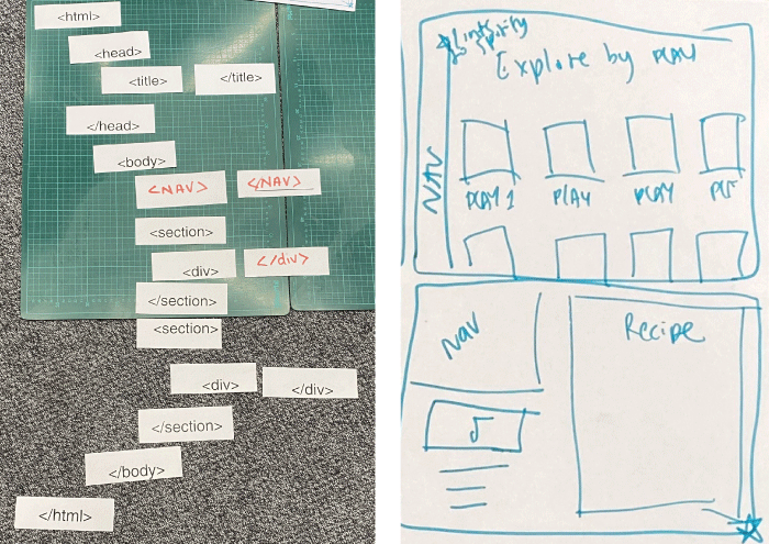
Using https://designercize.com/ take a prompt and sketch 4 screen designs for the prompt. From this we made the basic building blocks and tags of how one of the screens would look like in html
I was given the prompt: design a recipe website for music lovers. We then drew 4 screens. The screen design we chose to deconstruct into html tags is the bottom right. This screen depicts a navigation link, the song or playlist and the recipe that pairs best with it.
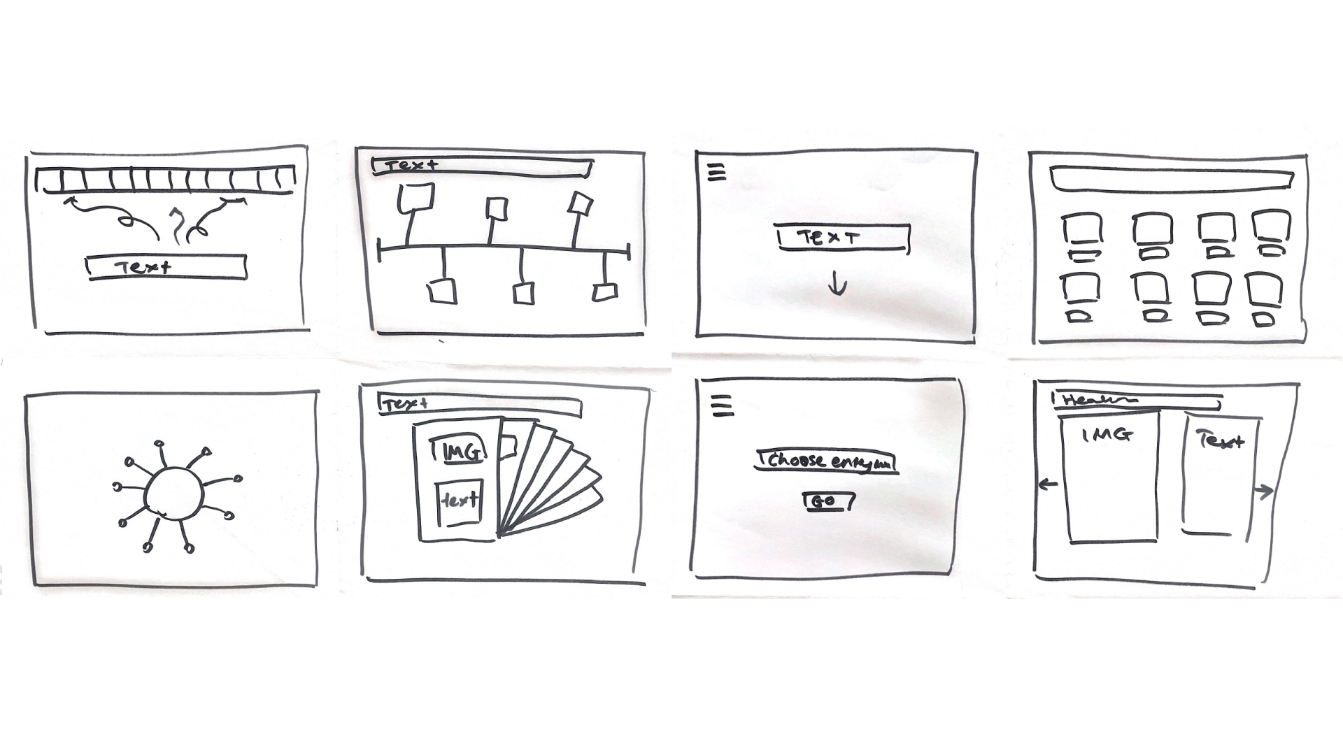
Using A3 paper I created 8 different website designs to begin the process of visually demonstrating ideas which could be used as a prototype for our on site. 2 references historical timelines and users could see the overview of my workbooks timeline and click the boxes to see the entries in more detail. 3 is a simple scroll website. 4 is a . 5 is a flower like circle with workbook entry petals which are interactive and will fall to the bottom of the screen when plucked. 6 is clickable sheets of each entry. 7 is a directory where the user must enter the entry number to access information
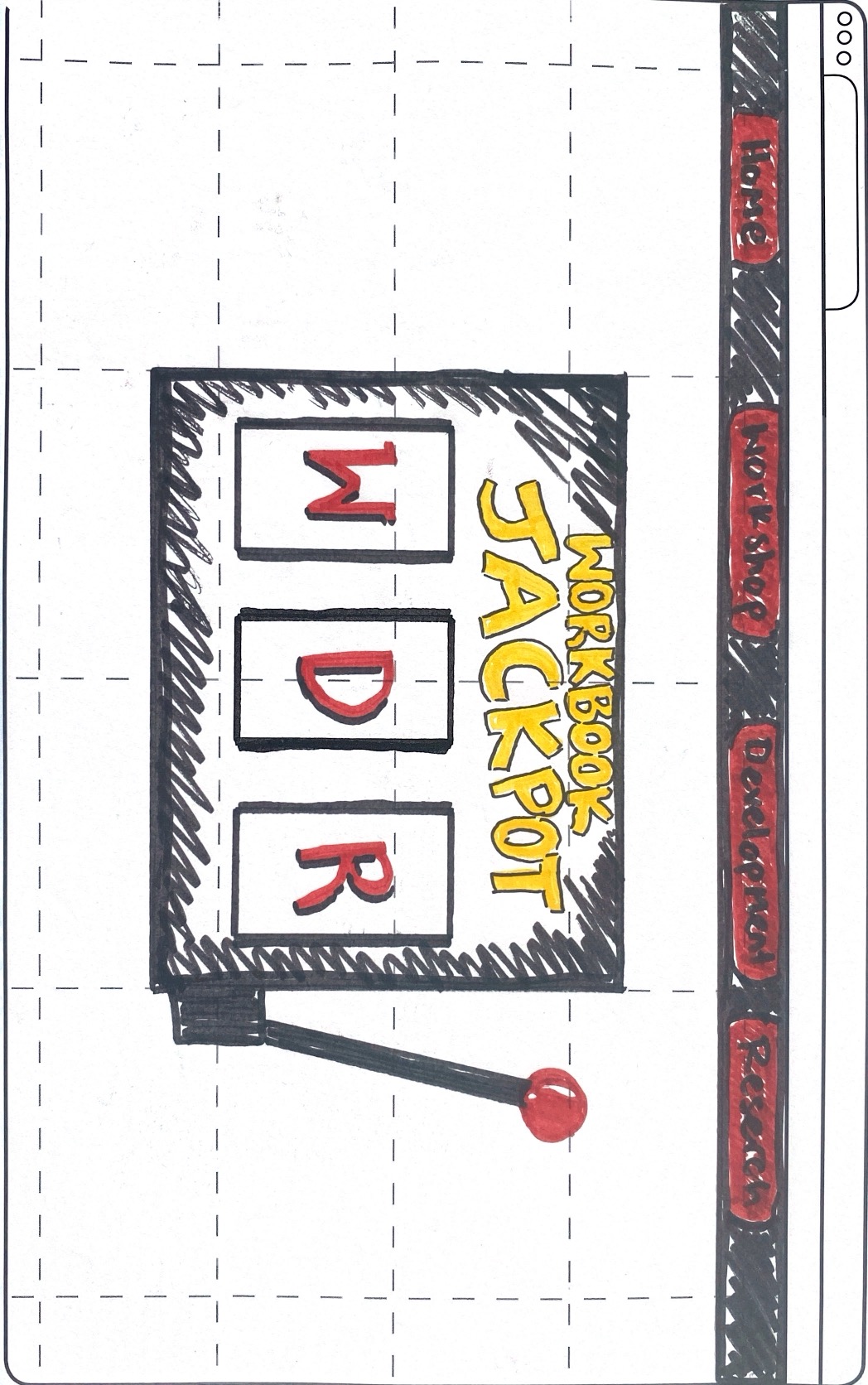
In this workshop we were asked to create a more detailed prototype for our website. My home page design illustrates a directory with the home page, workshop page, development page and research page so users can go access the information organised by type. Further more, the home page will have an interactive slot machine element in which users can play. If the user wins and gets a letter match (letters correlate to type e.g workshop = w) it will take them to the page. For more information on the purpose of this visit About
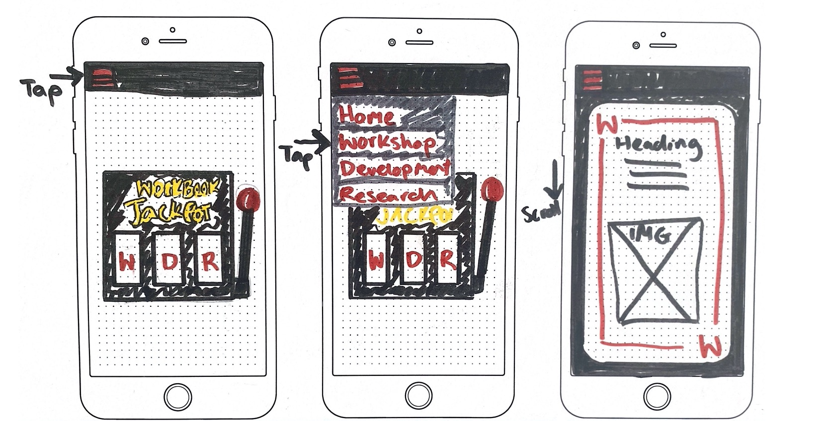
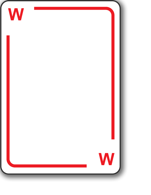
Using a template we were asked to articulate in a prototype how our website would translate to mobile devices. The ideas and concepts will stay the same however some basic reconfiguring will be needed in order to fit the smaller screen size. The directory for example will be condensed and will change to a tap down bar to maximise space and help readability. The workshop cards will also change and become the main component on the screen with both information and images inside the card. The cards will need to be tapped to flip and reveal information.